This option will only be available if the visibility check for Impacted Risk Map is enabled in the 'Settings/Analysis Methodology' section.
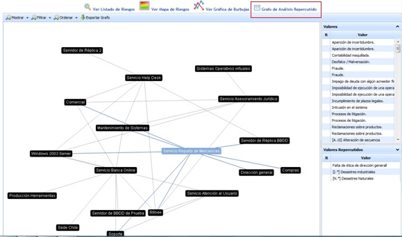
The ‘Threat Graph’ option graphically shows the dependency relationship between the different elements defined in the ‘Analysis/Inventory’ section.
Once the desired element is selected, the tool displays two lists with the following information:
-
Threats: Displays the list of threats specific to the selected element. The colors indicate the threat's risk level.
NOTE: The colors associated with the risk level can be parameterized in the ‘Settings’ section.
-
Impacted Threats: Displays the list of threats from those elements that depend on the selected element. The colors indicate the threat's risk level.
NOTE: The colors associated with the risk level can be parameterized in the ‘Settings’ section.
The options that the tool allows for the dependency graph are as follows:
-
Show: Allows filtering the list of elements and displaying the elements by services.
-
Filter: Allows filtering elements by levels.
-
Sort: Offers the possibility to sort the graph in two ways:
-
Automatic: When moving each of the nodes on the screen, the graph will automatically tend to cluster in the center.
-
Manual: When moving each of the nodes on the screen, they remain fixed in the marked position.
-
-
Export graph: Allows downloading the dependency graph in .png format